A website for a tea house or boba cafe with a menu too long for a photo
A tea house or boba cafe usually carries far more customization than a coffee shop, sweetness levels, toppings, tea bases, and a site built around one static menu photo cannot represent that without becoming unreadable.
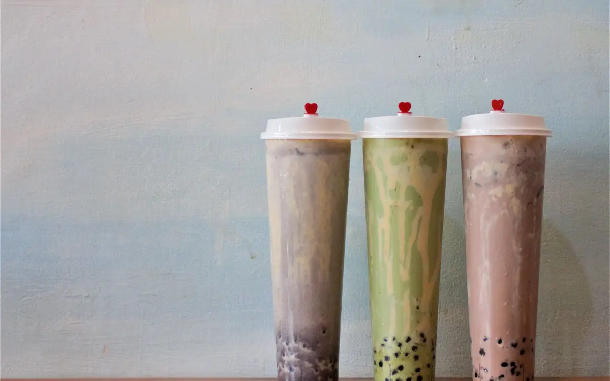
What usually goes wrong for tea houses and boba cafes
The customization options (sweetness, ice, toppings) exist only as a spoken explanation at the counter, never written anywhere online.
A long drink list is crammed into one dense photo that is unreadable on a phone.
Seasonal or limited drinks have no separate page, so they never build any search presence.
There is no page explaining tea sourcing or bases for visitors who care about that detail.
The pages your site will carry
Home
Menu with customization guide
Seasonal and limited drinks
Tea and ingredient sourcing
Location and hours
About
Contact
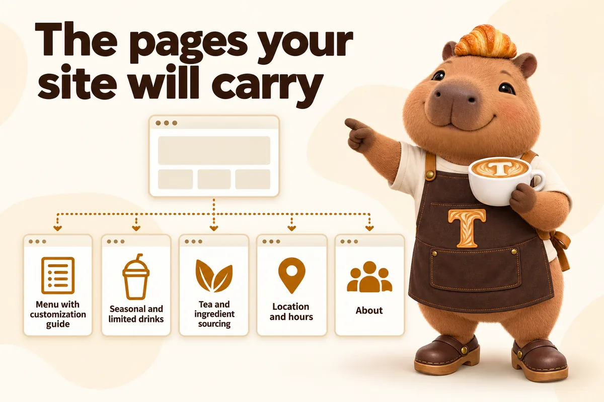
Doubles as a way to separate the standing menu from limited seasonal drinks, so the long core list and the short-lived specials do not compete for the same space.
What tea and boba shops owners say
Years of shared bakery preorders links were my concern, and they treated it as theirs. They inventoried the old addresses and walked us through where each one would redirect. Launching no longer meant abandoning everyone holding an old link.
We have only just started collecting this data for bakery preorders, and it has already changed our reviews. It shows which page an inquiry started on, not merely how many people visited. Even the first weeks of data sharpened our discussions.
Six months after launch
Six months after launch, first-time customers order at the counter already knowing sweetness levels and toppings because they read the guide on their phone in line. Limited drinks get their own page and build search presence each time they return. Staff spend less time explaining the same options, and the long menu is readable on a phone instead of a pinch-and-zoom photo.
Which plan fits tea houses and boba cafes?
Morning Shift covers the full menu, customization guide and seasonal page. Busy boba shops often choose Full Shift, where the AI chat answers "do you have oat milk" or "is the seasonal drink back" from what is on your site. Open to Close fits shops that want 3 articles a week.
Morning Shift, $117/ month: The website, fully managed, live in 7 days.
Full Shift, $247/ month + usage: Everything, plus the AI Engine, live in 10 days. Adds the AI receptionist, site chat and text replies.
Open to Close, $597/ month: Everything, plus the Content Engine, live in 15 days. Adds the AI receptionist, site chat and text replies, plus the Content Engine.
Every plan carries a $647 one-time build fee, invoiced only after you approve the live site.
Questions from tea houses and boba cafes
Can the menu show customization options without turning into a wall of text?
Yes, customization is written as a short reference guide next to the drink list rather than repeated under every item, which keeps the page skimmable while still answering the question before someone orders.
How do you fit a long boba menu on a phone?
The drink list is grouped by base, with customization written once as a short guide beside it, so the page stays skimmable.
Can the site explain sweetness and ice levels?
Yes. A short customization guide covers sweetness, ice, toppings and milk choices in your own words.
Can limited drinks get their own pages?
Yes. Seasonal and limited drinks get a standing page that says when they are usually available.
Can the site list caffeine-free or dairy-free options?
Yes, as you describe them. We publish the information you give us and do not make health or allergen claims.
Can we write about our tea sourcing?
Yes. A sourcing page covers teas and bases for visitors who care about where they come from.
Can the menu link to our delivery apps?
Yes. Clear pickup and delivery links go to the platforms you already use.
How often can the menu change?
As often as you send changes. 5 revisions a month are included, then $20 each, and one revision can carry many changes.
See it built for tea and boba shops
A live walk-through, on your screen, of the site you would get.
Book a demo